Figuring out how to handle simple problems when it comes to very complex software is like answering a puzzle. It gives head ache but the joy it would bring is indeed priceless when you hit the bull eye. However, the opposite is depressing especially if answer doesn’t exist or impossible. Still, you can have a short break and try stuff for a while and continue experimenting after.
Microsoft Office is a very known software but the depth of it was barely realized by many, only those who’s curious enough wanders the extremity of it. Even now, I’m still surprised to discover stuffs comprising it and finally realizing the full potential of it.
It’s not just a simple typing software, but a developer tool. It was something I realized late in my course. It is a programmer’s environment that I was taking for granted for I thought of Java, Turbo C and VB.Net stuff only. So much place to wander.
Anyway, the topic is not really of what Microsoft Office offers but this head aching simple task I was asked to make. Excites me. I miss programming.
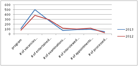
The Line Chart shows a word legend.
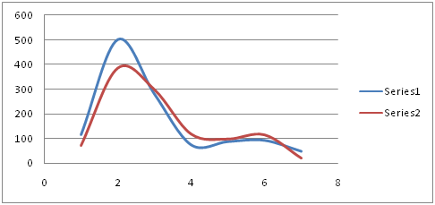
Shown in the chart is the legend (x-axis) represented by number. The main problem.
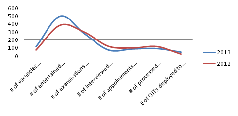
Shown above is the desired result of curved line chart with word as a legend.
SCATTER CHART’S
LEGEND NOT SHOWING (XY CHARTS)
A curve line chart
Problem:
She
wanted me to let the legend show below the Scatter Chart. In Line Chart, it is
an easy task as it will automatically place the legend below. But it was
something very hard when modifying Scatter chart.
Configuring
through Select Data Source window will
not solve the problem. I presumed the Scatter Chart is only intended through
number versus number axis. I almost gave up when suddenly I happened to convert
the Scatter Chart into Line Chart.
1. In the chart, right click the Horizontal (Category) Axis and click the Change Chart Type
2. Click the Line
in the Sidebar and click the first Line
in the choices and click Ok
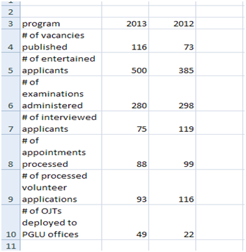
Raw data that will be used in chart
Reminder:
Before the instruction above to be done, proper selection
and configuration of data that will be used for the chart is still needed such
as proper highlighting of cells and selection of data for x and y axis.
There is always a solution; it may come in the form of right
way, short way or long way.
It’s always possible.
There is a help section but most of the time, it doesn't help.
It doesn’t make sense. It actually has sense.


No comments:
Post a Comment